Interior
The architect's eye — how to read light in a space
When I get an interior commission, I always ask to visit the space the day before the shoot. Not for half an hour — for two hours. No camera. No tripod. This is the most important hour of the entire project.
Architects don't see spaces the way we do. They see edges, planes, transitions between volumes. When I walk in without the camera, I try to learn that vocabulary. I sit in the middle of the room. I stand in the corners. I lie on the floor — literally. I look at the ceiling from a position the client would never take. Why? Because the ceiling photos reveal whether the interior has a soul or not.
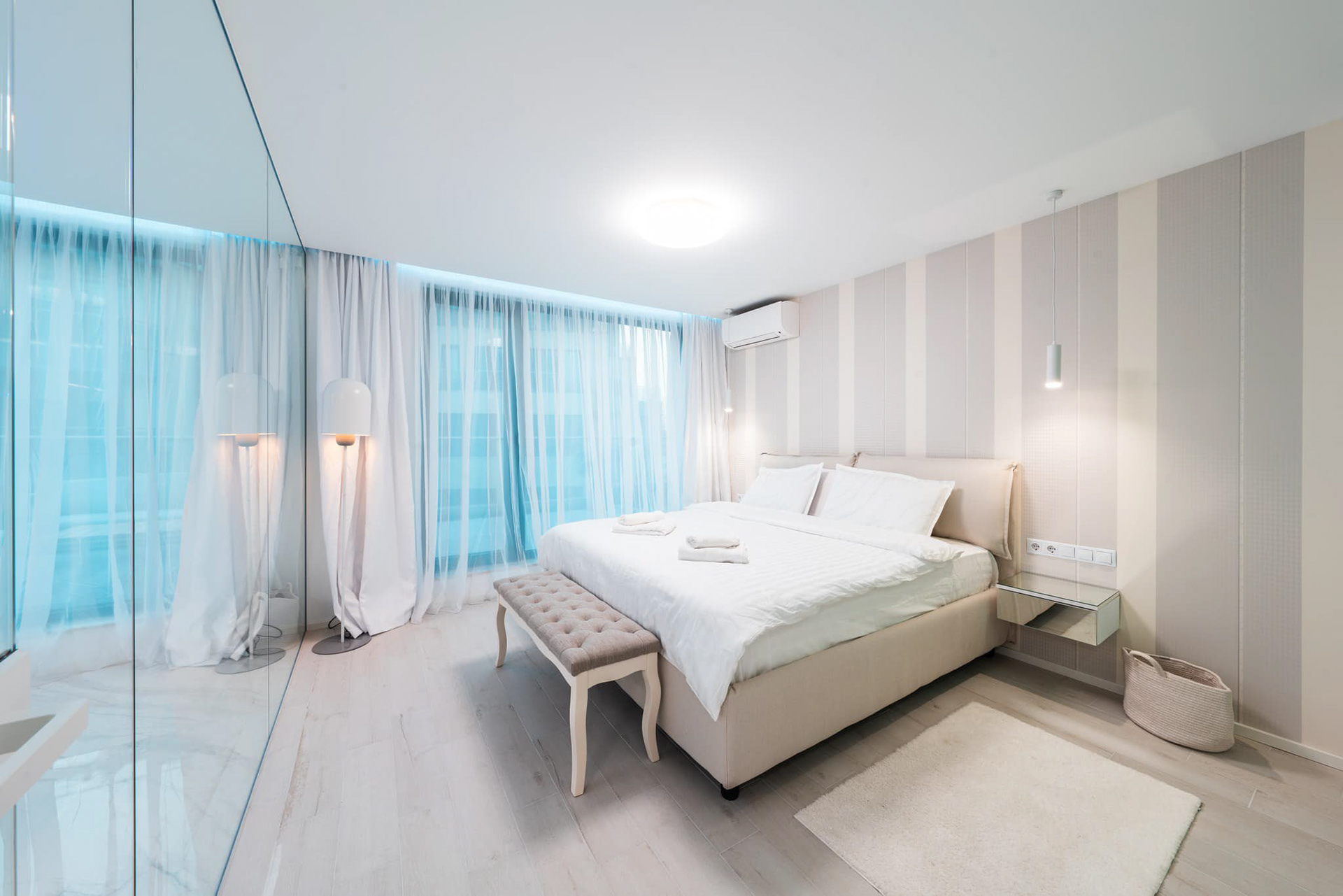
Light is the first thing I read. Where it enters. At what hour. What temperature — warm, neutral, cool. How it bounces off floors and walls. In one Burgas apartment with an oak floor, at 4 PM, the light does something you can't predict in Photoshop: it takes on the color of honey. That's the frame. You know it before you've raised the camera.
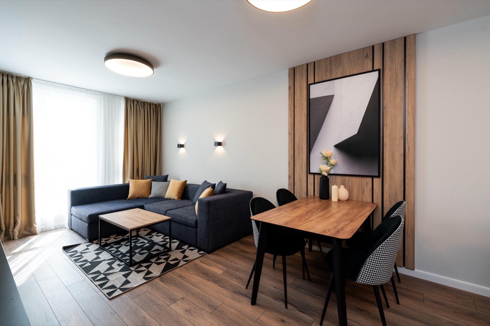
Then come the angles. For every interior I have a rule — three frames must describe it completely. One "establishing" — wide, showing the proportions. One middle — fixing how the space functions. And one detail — showing who lives here. If you can't describe a room in three frames, you don't understand it yet.
Mistakes beginners make in interior:
Too wide a lens. 14mm or 16mm distorts the lines. Rooms look bent, far away. Real estate agents love it — clients then wonder why everything looked smaller at the viewing. I don't work under 24mm, and most of the time I stay at 35mm.
Too clean. Real spaces have life. Clothes on a chair, a glass on the table, an open book. When you remove everything, the interior becomes sterile — a catalog, not a home. I ask the client to leave one or two traces.
Too symmetric. A perfectly centered frame looks drawn. A small asymmetry — a table that isn't exactly in the middle, a lamp tilted slightly, a rug shifted a few centimeters — makes the room real.
Flash. Never. Light in interior must be authentic — natural when possible, and continuous LEDs or existing lamps when not. Flash drains the atmosphere.
The tripod is mandatory. Not because your hands shake — but because at f/8 and ISO 200, exposure can take 1/15 of a second. That's impossible without a tripod, and the composition changes if you shift the frame between exposures.
And finally: an interior is not architectural graphics. It's a home, an office, a restaurant — a place of people. Even when there's no person in the frame, every frame must feel presence. You do that with details, with warmth, with small traces of life. Without them, you have a 3D render.
Ready to plan?
See what the packages include and where the prices start.
Related articles
Interior
How to prepare your property for an interior photoshoot
8 min read

Proposal
Marriage Proposal Photographer in Burgas — Hidden Photographer for the Perfect Surprise
12 min read

Christening
Christening photographer in Burgas — a complete guide to the ritual, the churches and the preparation
18 min read